At Inclusive Church, we’ve always been more than just a network. We are a movement, of people, churches, and communities committed to ensuring that the doors of faith are open to everyone, without exception.
So we wanted a new logo that could express that vision at a glance and reward a second look with deeper meaning. And here it is…
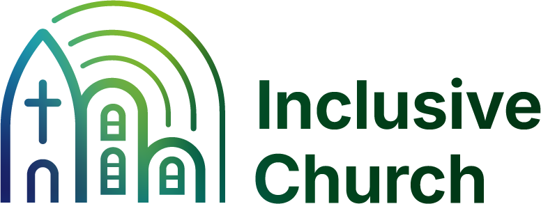
Inclusive Church new core logo with rainbow beam above a cluster of buildings, one with a cross.
One Image, Many Meanings
The shape at the heart of the new logo might first look like a church building, and it is. But not just one church.
We know that for some, the idea of “church” can be complicated, especially when tied to painful histories. A central element of Inclusive Church’s work is to reimagine church as a place of true inclusion, so we don’t want to abandon the symbol, but rather reclaim it. The building here is not fortress-like. It’s open at the base, with light and colour radiating from within. It invites, shelters, and holds space.
You might also see:
A signal tower or beacon — broadcasting welcome far beyond the building
A house — a reminder that inclusion must start at home
A row of buildings — because we’re a network of communities
An open shelter — holding space, not locking people out
The arc of colour might be a rainbow — a known and trusted symbol of LGBTQIA+ inclusion. But look again, and you might see:
A broadcast signal — connecting with those who can’t attend in person: the housebound, the shift-working, the long-isolated
A canopy of light — casting warmth, not shadow
A beacon of hope, a banner of sanctuary
An inclusive umbrella, under which many can shelter
Look closer still, and you might see something more personal:
A thumbprint — unique, human, real
Because inclusion is in our DNA. It’s who we are. It’s how we identify. It’s how we follow Jesus.
Colours: dark green and white; gradients of dark green, dark blue and occasional purples
A Visual Shift from Abstract to Embodied: From Cocoon to Communion
Our previous logo served us well, playful and colourful, affectionately known by some as “the hungry caterpillar.” But for those encountering us for the first time, it didn’t really communicate who we are or what we stand for.
We hope that this new design is clearer, warmer, and more adaptable, grounded in tradition, seeking to be faithful to our history but looking to a radically inclusive future that is open, diverse and accessible. We want Inclusive Church members to be easily recognisable as people and places of faith, compassion and welcome.
It’s a logo we hope you’ll be proud to wear, share, and display, and one that will tell a bigger story, even when we can’t.
At the Heart
At its core, we hope that this logo says:
Come in: You are seen. You are safe. You are included.
Inclusion isn’t just a value. It’s our calling. It’s our witness. It’s our identity.
The new logo isn’t just a single emblem, it comes with a suite of accompanying iterations, options and guidelines. Our member churches will be provided with a branding pack containing the logos to use on their own publicity and published material. We will also be developing some new posters and banners that churches can order.
We felt it was important to keep a clear connection with our history as we are building on those foundations. To reflect this, green continues to be our central colour. But we have shifted to a ombre colourway, that blurs the lines and reflects the intersectional reality that we all live and experience. This aspect also brings a very contemporary look.
In the development process with Festoon Studio we considered and consulted on a number of aspects regarding accessibility. The detail of that, if it interests you, is summarised in this document that you can download.
We are not asking or expecting our member churches to immediately rush out and reprint all their material with the new logo. We won’t be doing that ourselves either! That would be an impractical and unnecessary expense. The new visual identity will instead be gently rolled out, with adaptions and ‘glow ups’ as we go along. We invite you to do the same.
Our member churches will soon receive an invitation to reaffirm and renew their membership, and clarify that our records are up-to-date. For simplicity, the new branding pack will be issued at that point, but if you’d appreciate it sooner you are very welcome to contact us directly on office@inclusive-church.org
Please do not edit or adapt the logos, but use them as the usage guide recommends.
Part of a bigger picture
Our new Visual Identity is integrated with the new IC strategy which has a focus on becoming more widely visible, valued and active. There is a building momentum to our work and these are exciting times. To build on this we will be introducing a stream of ‘merch’ products for you to buy, use, wear and share, that will raise our profile and also increase our income – which will improve our capacity and ability to achieve our aims! Watch this space for that.
You can of course still donate financially without buying stuff!
Welcome to our Butterfly Era!
Why are we using ‘Butterfly Era’ if the new logo is not a butterfly? Because it echoes the journey we’ve been on and feels beautifully appropriate. Jesus often used metaphors after all! Let’s spread our wings with confidence as we seek to encourage, inspire and connect beyond ourselves, to something more, something better.